

How to Build a Neutral Living Room Palette That Works
A warm greige wall, a mid-taupe sofa, and a charcoal accent piece: that three-neutral combination works in almost any living room, and you can start testing it today. The system behind it is the three-neutral framework — 60% anchor (walls and large surfaces), 30% bridge (sofa, curtains, large rug), and 10% accent (cushions, art, small objects). Match all three to the same undertone family, and the room reads cohesive rather than muddy.
- Anchor (60%): Warm greige walls — try Benjamin Moore Pale Oak or Revere Pewter
- Bridge (30%): Mid-taupe upholstery in a linen or boucle fabric
- Accent (10%): Charcoal or deep mocha in cushions, frames, or a sculptural vase
Pro Tip: Hold a white sheet of paper next to your wall or sofa fabric. The color that “bounces back” from the neutral tells you its undertone: pink/yellow = warm, green/blue = cool. Match that undertone across all three layers before you buy anything.
Test a large paint swatch (at least 12 inches square) on two walls before committing. Check it at morning light, midday, and under your evening lamps. Neutrals shift more than any other color family under changing light.
Key Takeaways
A neutral living room palette succeeds when three undertone-matched layers — anchor, bridge, and accent — are tested under the room’s actual light before any major purchase is made.
| Point | Details |
|---|---|
| Use the 60/30/10 system | Assign anchor (walls), bridge (sofa/rug), and accent (art/cushions) roles before buying anything. |
| Match undertones, not shades | Every major element should share a warm, cool, or greige undertone family to avoid a muddy result. |
| Test large swatches in your room | Paint at least a 12-inch swatch on two walls and check it at morning, midday, and evening light. |
| Add texture before adding color | Linen, boucle, walnut, and matte ceramic create depth in a neutral room without breaking the palette. |
| Noble Abode accent pieces | Wall art and cushions from Noble Abode supply the 10% accent layer in warm or cool neutral schemes. |
Table of Contents
- Five ready-to-use neutral living room palettes
- How does light change the way neutral paint and fabric look?
- How to match undertones across walls, furniture, and textiles
- Why texture is the real design tool in a neutral room
- How to test paint and fabric before you commit
- How to add accent color and contrast without breaking the palette
- What most neutral room guides get wrong
- Noble Abode pieces that finish a neutral living room
- Sources
- FAQ
Five ready-to-use neutral living room palettes
Each palette below maps to the 60/30/10 system. Starting from fixed elements — your flooring, fireplace surround, or existing woodwork — and matching undertones across all three layers is what separates a polished room from one that just feels “off.”
| Palette | Best for | Undertone family | Walls (60%) | Upholstery/Rug (30%) | Accents (10%) | Paint/fabric example |
|---|---|---|---|---|---|---|
| Warm Greige | North-facing rooms, cozy traditional | Warm (yellow/pink) | Soft greige | Camel linen sofa, oatmeal rug | Terracotta cushions, brass lamp | BM Pale Oak OC-20 |
| Cool Stone Gray | South/west-facing, modern minimal | Cool (blue/green) | Light stone gray | Dove-gray velvet, white cotton | Slate blue throw, matte black frame | BM Stonington Gray |
| Greige Balanced | Mixed-light rooms, transitional style | Greige (neutral) | True greige | Warm white linen, natural jute rug | Charcoal, aged brass | BM Revere Pewter HC-172 |
| Sandy Cream | Small rooms, light-bright, Scandi | Warm (cream/ivory) | Sandy cream | Ivory boucle, bleached oak | Sage green, rattan | BM White Dove |
| Deep Mocha | Moody, cozy, larger rooms | Warm (brown/red) | Deep taupe/mocha | Cognac leather, chocolate wool | Cream, brushed gold | BM Kingsport Gray |
Visual inspiration: Design galleries on The Spruce show how each of these directions plays out in real rooms, with photo examples of material layering and furniture placement. Paint brand swatch pages — particularly Benjamin Moore’s neutral living room collection — let you filter by LRV and undertone family so you can find exact shades to sample.
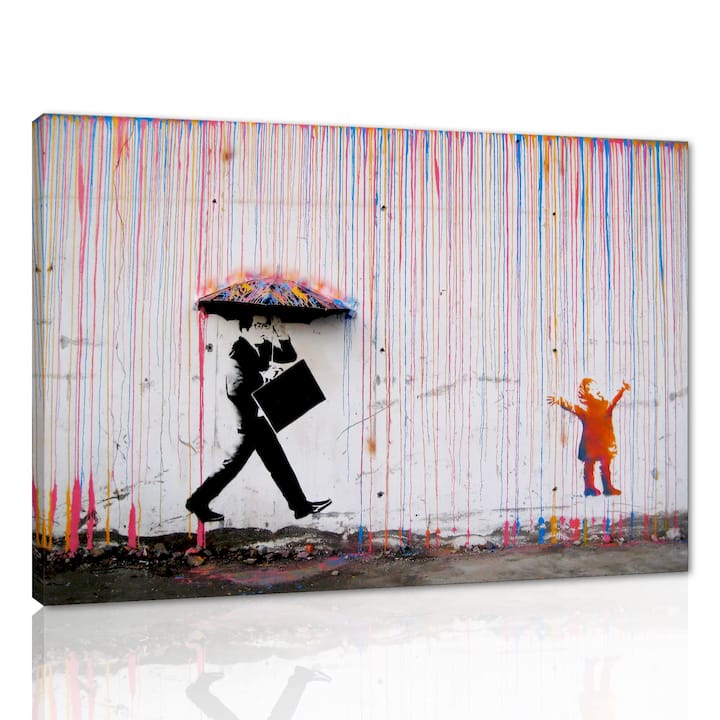
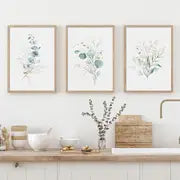
For the accent layer in any of these palettes, a large-format art print does the work of a statement piece without requiring furniture changes. The Banksy canvas wall art (36x24 inch, ready to hang) reads as a strong graphic anchor against warm greige or cool stone gray walls. For softer palettes — sandy cream, warm greige, or Scandi-inspired schemes — the floral leaf canvas triptych introduces organic form and subtle pattern without breaking the neutral scheme.
How does light change the way neutral paint and fabric look?
Room orientation is the single biggest variable most people skip. Benjamin Moore’s guidance is direct: warmer neutrals perform better in north- and east-facing rooms, while cooler neutrals suit south- and west-facing rooms. Here is why that matters in practice.
- North-facing rooms receive indirect, bluish light all day. A cool gray wall will look almost lavender by afternoon. Warm greige or cream walls counteract that blue cast and keep the room from feeling cold.
- East-facing rooms get warm morning light that fades to flat by afternoon. A warm neutral holds its tone through the day; a cool neutral can look washed out after noon.
- South- and west-facing rooms flood with warm, golden light. Cool stone grays and soft whites stay crisp rather than going yellow. A warm greige in these rooms can read almost orange by late afternoon.
- Mixed-light rooms (multiple exposures or skylights) are where true greige earns its place: it reads neither too warm nor too cold under shifting light.
Light Reflectance Value (LRV) tells you how much light a paint color bounces back. Mid-tone warm neutrals typically have an LRV range that balances brightness to keep a room feeling light but not sterile. Colors below 30 LRV absorb light and work best in large, well-lit rooms.
Pro Tip: Swap incandescent or warm LED bulbs (2700K–3000K) into your living room fixtures before testing swatches. Bulbs in the 3500K–4000K range push cool blue tones into every neutral, making warm greige look greenish and sandy cream look stark. The bulb temperature you live with is the one that matters.
Place test swatches on at least two walls — one that catches direct light and one in shadow. View them at three times: morning, midday, and after dark with your actual lamps on. A neutral that passes all three checks is a reliable choice.
How to match undertones across walls, furniture, and textiles
Undertones are the hidden pigments inside every neutral. Warm undertones carry yellow, red, or orange. Cool undertones carry blue, green, or violet. Greige sits between the two, blending gray and beige in roughly equal measure. The most common neutral-room mistake, according to Designlike’s palette research, is ignoring undertones entirely — which is why a room can feel “off” even when every individual piece looks fine in isolation.
Here is a reliable step-by-step method to keep undertones consistent:
- Identify your fixed elements. Note the undertone of your flooring, fireplace surround, built-in shelving, or any architectural feature you cannot change. These set the undertone family for the whole room.
- Determine the undertone family. Hold each fixed element next to a white reference (a sheet of printer paper works). The color that reflects back tells you whether the piece leans warm, cool, or greige.
- Choose your anchor neutral. Pick a wall color that complements — not necessarily matches — the fixed elements. If your oak floor is warm honey, a warm greige wall (not a cool gray) will harmonize. If your floor is a cool ash gray, a soft stone or greige wall keeps the room from fighting itself.
- Choose your bridge neutral. The bridge (sofa, curtains, large rug) should vary from the anchor in value (lighter or darker), not in temperature. A warm greige wall pairs with a warm ivory sofa or a warm mid-taupe rug — not a cool dove gray that pulls in the opposite direction.
- Choose your accent neutral. The 10% accent layer can go slightly deeper or more saturated than the anchor and bridge, but it still shares the undertone family. Deep charcoal works with cool palettes; deep mocha or cognac works with warm ones.
Pro Tip: The white-paper test works on fabrics and wood finishes too, not just paint. Hold a swatch of your sofa fabric or a wood sample against a white sheet in natural light. The undertone becomes obvious within seconds — a trick that saves hours of second-guessing in the store.
When you cannot repaint — in a rental, for example — the bridge and accent layers do most of the corrective work. A warm-toned rug and warm linen curtains can pull a cool-gray rental wall into a warmer, more cohesive scheme without touching the paint.
Why texture is the real design tool in a neutral room
Color does less work in a neutral palette than most people expect. Texture is what creates richness, depth, and visual interest — and design galleries consistently show that rooms built on natural materials and tactile contrast read far more sophisticated than rooms that simply layer pale neutrals on top of each other.
- Linen and boucle on upholstery catch light differently at different angles, creating subtle tonal variation without adding color.
- Wool and chunky-knit throws introduce softness and weight that make a neutral sofa feel intentional rather than plain.
- Matte ceramic vases and sculptural objects absorb light rather than reflecting it, adding contrast against smooth painted walls.
- Warm walnut and oak in side tables or shelving bring natural grain that reads as warmth without any pigment.
- Raw stone or concrete in a fireplace surround or coffee table adds a cool, grounding element that balances warm fabric tones.
- Brass and brushed gold in lamp bases or hardware introduce a warm metallic note; matte black frames and handles add cool contrast. Mixing two metal finishes — one warm, one cool — keeps the room from looking like a showroom catalog.
For the accent layer, Noble Abode’s creative modern vase in a matte or textured finish adds sculptural contrast on a shelf or console without competing with the wall color. Layered sofa cushions in a slightly deeper or more textured fabric than the sofa itself do the same job at the bridge-to-accent boundary.
How to test paint and fabric before you commit
Buying a gallon of paint based on a chip the size of a business card is one of the most reliable ways to end up repainting. A proper testing routine takes one weekend and prevents that outcome.
- Paint large swatches. Apply at least two coats of each candidate color on a 12-by-12-inch (or larger) section of at least two walls — one that receives direct light and one that stays in shadow most of the day.
- Test next to fixed elements. Move the swatch board or painted section close to your flooring, fireplace, or existing furniture. Undertone clashes are obvious at this stage.
- Observe at three times of day. Check the swatch at morning light (before 10 AM), midday, and after dark with your lamps on. Record what you see: does it look warmer or cooler than expected? Does it shift significantly between observations?
- Test under your actual bulbs. Swap in the bulbs you plan to use long-term before making a final call. A warm-toned bulb (2700K–3000K) will push any neutral warmer; a cooler bulb (3500K–4000K) will push it cooler.
- Make a decision note. Write down the time, bulb type, and your verdict for each candidate. This record prevents second-guessing when you return to the paint store.
When to repaint vs. when to solve with textiles:
- If the wall color clashes with fixed flooring or built-ins at every time of day, repaint — textiles cannot fully correct a fundamental undertone mismatch.
- If the wall reads slightly cooler or warmer than ideal but the undertone family is correct, solve it with the bridge layer: a warmer rug or warmer curtains can shift the room’s perceived temperature without touching the walls.
Protecting yourself on larger purchases:
- Order fabric samples before committing to a sofa or curtain order. Most reputable suppliers offer them.
- For small decor items, check the return window before buying. Noble Abode’s small apartment decorating guide covers practical tips on testing scale and proportion in compact rooms before committing to larger pieces.
How to add accent color and contrast without breaking the palette
A neutral room that reads flat usually lacks contrast, not color. The fix is deliberate placement of darker values, pattern, and visual anchors — not adding a saturated hue.
The 3-5-7 rule adapted for neutral rooms works like this: use 3 neutral layers (anchor, bridge, accent), introduce 5 distinct textures or materials, and create 7 points of visual interest distributed around the room. Those seven points can be as simple as a lamp, a framed print, a throw, a vase, a stack of books, a patterned rug, and a plant.
Choosing accent colors that complement the neutral undertone family:
- Warm greige and taupe palettes pair well with terracotta, deep rust, aged brass, and forest green — all warm-adjacent tones that share the yellow/red undertone family.
- Cool stone gray and greige palettes work with deep navy, slate blue, and matte black — cool tones that reinforce rather than fight the base.
- Warm vs. cool neutral behavior means the accent color should lean in the same direction as the anchor, not cross the warm/cool divide.
Practical placement tips:
- A patterned rug anchors the seating area and introduces contrast at floor level, where it reads as grounding rather than busy.
- A darker accent chair — charcoal in a cool palette, cognac leather in a warm one — creates a focal point without requiring a full furniture change.
- Black or charcoal frames on wall art add crisp definition against pale walls. A large-format canvas print in a bold graphic style does this effectively in a warm greige or cool gray room.
- A dark side table placed near a lighter coffee table creates a value contrast that draws the eye and makes the seating arrangement feel intentional.
- Console table styling — a vase, a stack of books, a small lamp — gives you a compact cluster of visual interest that counts as three of your seven points in one spot.
What most neutral room guides get wrong
The conventional advice is to “keep it simple” with neutrals. In practice, that instruction produces the flattest, most forgettable rooms. Simplicity is not the goal — coherence is.
The three-neutral system works not because it limits choices but because it forces a decision about undertone before anything gets purchased. Most rooms that feel “off” were built by accumulating pieces that each looked fine in isolation, with no one checking whether the warm honey floor, the cool dove-gray sofa, and the pink-beige walls were pulling in three different directions. They were. The 60/30/10 framework is really just a prompt to make that undertone decision early and stick to it.
Texture deserves more credit than it gets in most guides. A room built on linen, boucle, walnut, and matte ceramic will feel rich and considered even if every surface is within three shades of the same greige. A room with perfectly matched paint and fabric but no material variation will feel like a waiting room. The MyDomaine designer-approved palettes consistently show this: the rooms that photograph well and feel good to live in are the ones where material contrast does the heavy lifting.
One more thing worth saying: the testing routine is not optional. Paint looks different in your room than it does on a chip, on a screen, or in someone else’s photograph. The light in your room is specific to your room. Spend the weekend on large swatches and save yourself a repaint.
Noble Abode pieces that finish a neutral living room
A well-chosen neutral palette does most of the work. The finishing layer — art, cushions, vases, lamps — is where the room gets its personality. Noble Abode curates exactly that layer: statement pieces with clean lines and premium materials that sit comfortably in warm greige, cool gray, or balanced greige schemes without competing with the base palette.
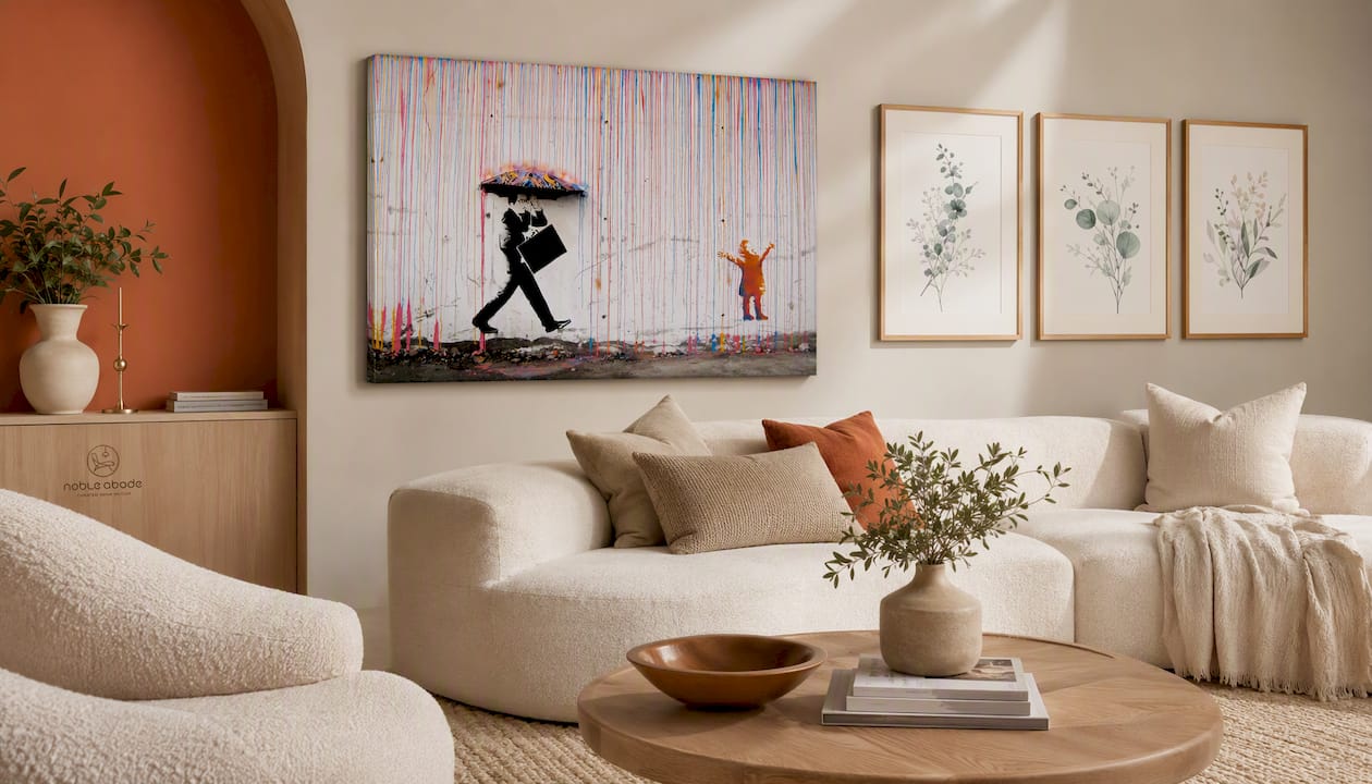
For the accent wall in a warm or cool neutral room, the Banksy-inspired canvas wall art (36x24 inch, ready to hang) delivers a bold graphic focal point without requiring a furniture change. For softer palettes — sandy cream, warm greige, or Scandi-inspired schemes — the floral leaf canvas triptych introduces organic pattern and subtle warmth that reads as intentional rather than decorative. Both ship ready to hang. Browse the full Noble Abode home decor collection to find accent pieces that complete your palette — and check product pages for return details before ordering.
Sources
- Neutral Paint Colors for Living Rooms | Benjamin Moore
- Why your neutral living room looks flat (and how to fix it) | Designlike
- How to Choose a Neutral Living Room Color Palette That Works | EcoHouseDecor
- Warm vs. Cool Neutrals: The Lighting Test That Settles It - Comfortalife
- 37 Neutral Living Room Ideas for a Cozy, Calming Space | The Spruce
FAQ
What is the best neutral color for a living room?
Warm greige — a blend of gray and beige with a yellow or pink undertone — performs reliably across the widest range of room orientations and styles. Benjamin Moore Pale Oak (OC-20) and Revere Pewter (HC-172) are two of the most consistently recommended starting points.
What is the 3-5-7 rule in interior design?
In a neutral living room, the 3-5-7 rule means using 3 neutral layers (anchor, bridge, accent), 5 distinct textures or materials, and 7 distributed points of visual interest — a lamp, framed art, a throw, a vase, a rug, a plant, and one more accent object.
What color is replacing beige in 2026?
Warm greige and soft stone tones are the dominant shift: they carry the warmth of beige but with enough gray to read modern rather than dated. Deep mocha and cognac accents are appearing alongside these bases as the preferred contrast note.
What is the 3 color rule in interior design?
The 3 color rule assigns one dominant color (60% of the room), one secondary color (30%), and one accent color (10%). In a neutral palette, all three stay within the same undertone family — warm, cool, or greige — so the room reads cohesive rather than busy.