

Gallery Wall Layout: Hang It Right the First Time
A reliable gallery wall layout follows one formula: anchor with your largest piece, keep a consistent 2–3 inch gap between every frame, and center the whole group at 57–60 inches from the floor. Before drilling a single hole, test the plan with paper templates or a free online planner.
Three measurements to confirm before you hang:
- Frame-to-frame gap: 2–3 inches, picked once and applied everywhere
- Above furniture clearance: a small gap from the top of your sofa or console
- Center of the full group: 57–60 inches from the floor (eye level)
Run the layout through a digital planner or tape full-size paper cutouts to the wall first. Both methods let you catch spacing errors and scale problems before any nail goes in.
Key Takeaways
A consistent 2–3 inch gap between frames, a group center at 57–60 inches from the floor, and a paper-template mockup before drilling are the three steps that determine whether a gallery wall looks planned or accidental.
| Point | Details |
|---|---|
| Anchor piece first | Hang the largest frame first; all other frames align relative to it. |
| Consistent spacing | Pick 2 or 3 inches and apply that gap to every frame pair in the layout. |
| Center height rule | Position the visual center of the whole group at 57–60 inches from the floor. |
| Mock up before drilling | Tape full-size paper templates to the wall and confirm scale before marking any nail points. |
| Noble Abode ready-made sets | The 2pcs and 3pcs Floral Leaf Canvas sets are sized for common starter templates and ship ready to hang. |
Useful planning tools and spacing guides
- GalleryPlanner: Browser-based planner with real-scale canvas, auto-layout modes, and exportable hanging guides with exact hook positions.
- Gallery Wall Spacing and Alignment Tips: Detailed reference for the 2–3 inch gap rule, 57–60 inch center height, and 6–10 inch above-furniture clearance.
- MyWallDecorator 67 free templates: Editable, printable starter layouts for grid, salon, and rectangular groupings.
- WallMockup planning guide: Step-by-step mockup method and advice on using paper templates as the final check before drilling.
- Frame Today gallery wall guide: Professional sizing guidelines and the 60% wall-coverage rule.
- Gallery Wall Builder on GitHub: Open-source, local-first browser tool with drag-and-drop canvas and PNG/PDF export.
Test your layout in a planner or with paper templates before drilling. The extra 20 minutes saves a wall full of unnecessary holes.
Table of Contents
- What are the right spacing and height measurements for a gallery wall?
- How to plan and hang a gallery wall step by step
- Which gallery wall layout style fits your space?
- Which free tools help you plan a gallery wall layout?
- How to transfer your plan to the wall and hang it safely
- What are the most common gallery wall mistakes?
- How do you make a gallery wall look cohesive?
- Where can you find printable gallery wall templates?
- When should you buy shop-ready art versus DIY prints?
- Start with the largest piece and build outward
- Ready-made art sized for gallery walls
- Sources
- FAQ
What are the right spacing and height measurements for a gallery wall?
Precise numbers remove the guesswork. According to Gallery Wall Spacing and Alignment Tips, the three core measurements are a 2–3 inch frame gap, a 57–60 inch center height, and a 6–10 inch clearance above furniture.
Frame-to-frame spacing
Use 2 inches for tight, uniform grids where frames are the same size. Use 3 inches for mixed-size or salon-style arrangements where the extra breathing room prevents the wall from feeling cluttered. Whichever you choose, apply it everywhere. Consistency matters more than the exact number.
Center height and eye-level rule
Treat the visual center of the entire group as your reference point, not any single frame. Position that center at approximately 57–60 inches from the floor. When hanging above a sofa or console, the bottom edge of the lowest frame should sit 6–10 inches above the furniture top.
Two worked examples
Above a sofa: Your sofa back sits 36 inches from the floor. Add 6–10 inches of clearance, so the bottom frame edge starts at 42–46 inches. If your group spans 24 inches tall, the top edge reaches 66–70 inches and the visual center lands near 57 inches. That checks out.
Free wall, no furniture: Target a center of 58 inches. If your group is 30 inches tall, the bottom edge hangs at 43 inches and the top at 73 inches. Mark 58 inches on the wall first, then measure up and down from that point.
| Measurement | Standard | Notes |
|---|---|---|
| Frame-to-frame gap | 2–3 inches | 2" for grids; 3" for salon/mixed |
| Center of group from floor | 57–60 inches | Treat group center, not single frame |
| Bottom frame above furniture | 6–10 inches | Measured from furniture top |
| Maximum wall coverage | 60–70% | Leave negative space to avoid crowding |
Pro Tip: On a wall with ceilings above 9 feet, raise the center height to 62–64 inches so the arrangement doesn’t look low-slung. For very low seating like floor cushions or a platform bed, drop to 54–56 inches.
How to plan and hang a gallery wall step by step
A clear sequence prevents the most common errors. Work through these steps in order.
- Measure the wall. Record width and height. Note any obstructions (outlets, switches, windows). Measure the furniture below and mark its top edge on the wall lightly with a pencil.
- Choose a layout pattern. Grid for uniform frames, salon for mixed sizes, triptych or linear for narrow walls. Pick one before you start sizing.
- Calculate the footprint. Add up frame widths plus gaps for the horizontal span. Add frame heights plus gaps for the vertical span. Compare against your wall width to confirm fit.
- Arrange on the floor or in a planner. Lay all frames on the floor in the chosen pattern. Adjust until the arrangement looks balanced. Alternatively, input dimensions into a free online planner and test spacing digitally.
- Make paper templates. Cut kraft paper or newspaper to the exact size of each frame. Label each cutout with the frame name and its hanging hardware position (hook or wire drop).
- Tape templates to the wall. Use painter’s tape. Step back and check scale, spacing, and center height. Live with the mockup for a few hours before committing.
- Mark anchor points. With templates still taped up, mark every nail or hook position through the paper. Remove templates carefully.
- Hang the largest piece first. Center it on your pre-marked anchor point. This is the visual anchor everything else aligns to.
- Work outward from the anchor. Hang adjacent frames one at a time, checking the gap with a ruler or spacer after each.
Pro Tip: Treat a cluster of small frames as a single visual unit. Measure the cluster’s outer boundary, center it as one block, then space the individual frames within it at your chosen gap. This keeps the overall layout balanced even when frame sizes vary.
Flow at a glance: measure → choose pattern → calculate → arrange → template → tape → mark → hang anchor → work outward.
Which gallery wall layout style fits your space?
The right style depends on your frame collection, wall shape, and the room’s function.
-
Grid. Uniform frames in rows and columns. Clean, modern feel. Works best with matching or near-matching frame sizes. Ideal for living rooms and home offices. A grid is the most forgiving starting point for beginners because the math is straightforward: pick frame count, pick gap, and the arrangement follows. Try a 3×2 or 4×3 arrangement with 8×10 inch frames as a starter template.
-
Salon (eclectic). Mixed frame sizes and orientations arranged around a central anchor piece. Organic, collected feel. Suits living rooms above a sofa or a large blank wall. Start with one large anchor piece (16×20 or larger), then build outward with medium and small frames. Use 3-inch gaps throughout.
-
Triptych. Three frames in a horizontal or vertical line, often the same size. Minimal, gallery-like feel. Works well above a bed, console, or in a hallway. A set of three 12×16 or 11×14 frames is a reliable starter size.
-
Skyline. Frames aligned along a shared top or bottom edge, varying heights. Creates a dynamic silhouette. Good for long horizontal walls and above low furniture like a credenza or media console.
-
Staircase. Frames follow the diagonal line of a staircase wall, stepping up or down. Works only on stair runs. Align the center of each frame to the stair’s rise line for a clean diagonal.
For small spaces, a vertical triptych or a compact 2×3 grid keeps the arrangement proportional. More guidance on gallery walls in small rooms covers scale choices for tighter layouts.
Which free tools help you plan a gallery wall layout?
Digital planners remove the trial-and-error from spacing and sizing. Here are the main tool types and what each gives you.
-
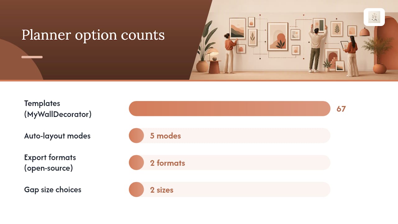
Browser-based planners with real-scale canvas (such as GalleryPlanner): Input your exact wall dimensions, add frames by size, drag to arrange, and export a drill-ready PDF with hook positions and measurements. Auto-layout options include Grid, Masonry, Skyline, Spiral, and Scatter modes. Planners that process images locally in the browser also protect your privacy since no files are sent to a server.
-
Open-source and local-first builders (such as the Gallery Wall Builder on GitHub): Drag-and-drop canvas, background removal, prebuilt templates, and PNG or PDF export. Runs entirely in the browser. Good for users who want full control without creating an account.
-
Template libraries (such as MyWallDecorator’s 67 free templates): Editable starter layouts for grid, salon, and rectangular groupings. Download, scale to your wall, and print. No software setup required.
Quick workflow for any planner:
- Measure wall width and height.
- Input dimensions into the planner.
- Add each frame by its exact size.
- Choose a template or run auto-layout.
- Adjust spacing to your chosen gap (2 or 3 inches).
- Export the hanging guide or PDF.
- Print templates at home or at a print shop and tape to the wall.
Pro Tip: Beginner-friendly features to look for: auto-layout, snap-to-grid, and a PDF hanging guide export. Advanced users benefit from Smart Fill, custom canvas backgrounds (upload a photo of your actual wall), and multi-frame grouping tools.
How to transfer your plan to the wall and hang it safely
Once the mockup is confirmed, installation is a matter of accurate transfer and the right hardware.
- Keep paper templates taped to the wall. Mark every nail or hook position through the template with a pencil.
- Remove templates one at a time. Circle each mark so it stays visible.
- Check marks with a level before drilling. A 24-inch torpedo level works for horizontal alignment.
- Select hardware based on wall type (see table below).
- Install anchors or hooks at each marked point.
- Hang the largest frame first. Verify it is level before moving on.
- Hang remaining frames outward from the anchor, checking the gap after each.
| Wall type | Recommended hardware | Notes |
|---|---|---|
| Drywall with stud behind | Picture hook or screw into stud | Most secure; locate stud with a stud finder |
| Drywall, no stud | Molly bolt or toggle bolt | For frames over 5 lbs |
| Plaster | Plaster anchor or screw with wall plug | Pre-drill slowly to avoid cracking |
| Concrete or brick | Masonry anchor and screw | Requires hammer drill |
Nail height math for wired frames: Hang the frame on a hook, then measure the distance from the top of the frame to where the wire sits taut. Subtract that distance from the top-edge mark on your template. That is where the nail goes.
For D-ring hangers, the nail goes directly behind the D-ring position. For sawtooth hangers, center the nail on the sawtooth strip.
Pro Tip: Use a stud finder before marking any anchor point. Also check for wiring and plumbing zones (typically within 12 inches of outlets and switches) before drilling. Wear eye protection when drilling into plaster or masonry.
What are the most common gallery wall mistakes?
Most errors come down to height, spacing, or scale. Each has a straightforward fix.
- Hanging too high. The group’s center ends up above 60 inches and feels disconnected from the room. Fix: re-mark the center at 57–60 inches and rehang from there.
- Inconsistent spacing. Gaps vary across the arrangement, making it look unplanned. Fix: pick one gap (2 or 3 inches) and use a ruler or cardboard spacer between every frame.
- Covering more than 70% of the wall. The display overwhelms the room. Fix: remove two or three pieces and redistribute the remaining frames with slightly wider gaps.
- Not anchoring to furniture. The arrangement floats on the wall with no visual connection to the sofa or console below. Fix: position the bottom frame 6–10 inches above the furniture top.
- Skipping the mockup. Nail holes end up in the wrong place. Fix: always tape full-size paper templates to the wall before drilling.
- Starting with the smallest frames. The layout loses its anchor and looks scattered. Fix: hang the largest piece first and build outward.
Negative space reminder: Aim to cover no more than 60–70% of the focal wall area with frames. The remaining 30–40% of open wall is what makes the arrangement look curated rather than crowded.
How do you make a gallery wall look cohesive?
Cohesion comes from repeating one or two design elements across the whole arrangement.
Do:
- Use a consistent mat width (1.5–2 inches) across all framed prints. This unifies mixed-size frames visually.
- Repeat one frame color or finish (all black, all natural wood, all white) even when frame profiles vary.
- Anchor with one large piece that sets the color palette for the rest.
- Treat clusters of small frames as single visual units when spacing them against larger pieces.
Don’t:
- Mix four or more frame finishes without a unifying element (mat color, subject matter, or palette).
- Use random orientations without a plan. Mixing portrait and landscape works, but anchor the mix with a dominant orientation.
- Fill every inch of wall. Negative space is part of the design.
Mixing orientations works well when one size dominates. For example, a salon wall with mostly portrait frames reads as intentional even with two or three landscape pieces mixed in. The key is that the anchor piece sets the dominant direction.
Pro Tip: When mixing art styles (photography, illustration, canvas), repeat a single color from the anchor piece in at least two other frames. This creates a visual thread that ties unrelated subjects together.
For broader styling guidance, home decor ideas covers palette and accessory choices that complement gallery walls.
Where can you find printable gallery wall templates?
Template libraries save significant planning time. Three reliable sources:
- MyWallDecorator’s 67 free templates: Editable starter layouts covering grid, salon, and rectangular groupings. Download, open in a PDF editor, and scale to your wall dimensions.
- GalleryPlanner’s built-in template library: Accessible directly inside the planner. Select a template, input your wall size, and the tool scales the layout automatically.
- Printed at home: Print any template at 100% scale on standard letter paper, tape sheets together for larger layouts, and use the assembled printout as your wall mockup.
Scaling and printing steps:
- Measure your wall and note the ratio (e.g., 72 inches wide × 96 inches tall).
- Open the template in a PDF viewer. Set the print scale to match your wall ratio.
- Print on letter paper and tape sheets together.
- Tape the assembled template to the wall. Confirm spacing and lighting before marking any nail positions.
For apartment layouts where wall space is limited, studio apartment decorating ideas covers compact template choices and vertical groupings that work in tighter rooms.
When should you buy shop-ready art versus DIY prints?
Shop-ready, curated art sets offer one clear advantage: the sizing is already resolved. A matched set arrives in coordinated dimensions, which means it maps directly onto standard starter templates without any resizing.
Noble Abode focuses on curated, ready-to-hang pieces sized and styled to fit common gallery wall templates. For homeowners and renters who want a reliable result without the planning overhead, shop-ready sets reduce the variables. DIY framing suits budget-conscious projects or sentimental pieces that need custom sizing. The two approaches can also be combined: use a curated set as the anchor group and fill surrounding slots with personal prints.
DIY framing makes sense when you have prints with non-standard dimensions or when the budget is the primary constraint. The trade-off is time: sourcing frames, cutting mats, and confirming scale all add steps.
For most starter gallery walls, a curated set of two or three coordinated pieces handles the anchor position cleanly. Personal prints and smaller frames fill the surrounding slots.
Start with the largest piece and build outward
The anchor piece is the structural center of any gallery wall design. Every other frame’s position is calculated relative to it, which is why hanging it first prevents the most common layout errors.
Choose the largest frame in your collection, or the one with the strongest visual weight (a bold canvas, a large photograph, a statement print). Center it on your pre-marked 57–60 inch reference point. Then measure outward from its edges, applying your chosen 2–3 inch gap to place the next frames.
This sequence works for every layout style. In a grid, the anchor sits in the center of the grid. In a salon arrangement, it anchors one side or the visual center of the cluster. In a triptych, it is the middle panel. Starting from the largest piece and working outward keeps the arrangement balanced from the first nail.
A decorator’s note on what actually matters
The single habit that separates a clean result from a frustrating one is the mockup step. Tape full-size paper cutouts to the wall and live with them for at least a few hours, ideally 24 hours. Lighting changes through the day, and a layout that looks balanced at noon can feel off-center by evening. Step back after taping each template, not just at the end.
The measurements in this article are starting points. Adjust the center height by an inch or two if your ceiling height or furniture scale calls for it. What matters is that the group reads as a single composition from across the room, not that every number matches a textbook formula exactly.
Ready-made art sized for gallery walls
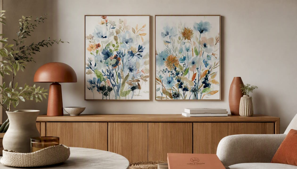
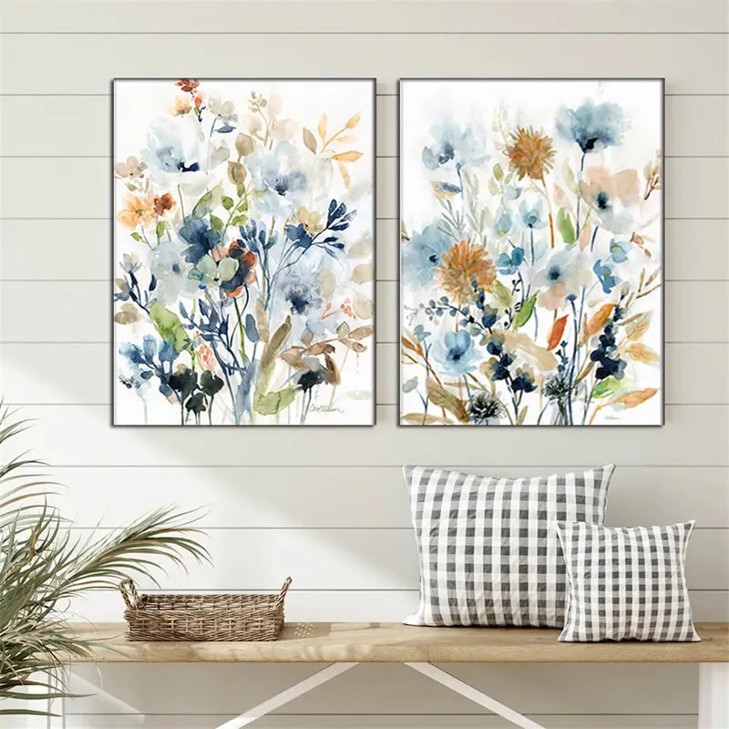
Noble Abode’s 2pcs Floral Leaf Canvas Art Posters are sized to pair directly with common starter templates and can be hung immediately without additional framing. The two-piece set works as an anchor pair in a triptych layout or as the central unit in a salon arrangement. The palette is neutral enough to coordinate with personal prints and mixed frames.
For a broader selection of ready-to-hang pieces that fit standard gallery templates, browse the 3pcs Floral Leaf Canvas Wall Art set, which adds a third panel for triptych or linear layouts. Both sets ship ready to hang, with hardware included.
Sources
- Gallery Wall Spacing and Alignment Tips — GalleryPlanner
- How to Plan a Gallery Wall Layout (With Mockups) — WallMockup
- Free Online Gallery Wall Designer — GalleryPlanner
- 67 free templates for gallery walls — MyWallDecorator
- Design the perfect gallery wall — Frame Today
- Gallery Wall Builder — GitHub (FrameRoom-style project)
FAQ
What is the rule for gallery walls?
The core rule is three measurements: keep 2–3 inches between frames, position the group’s visual center at 57–60 inches from the floor, and place the bottom frame 6–10 inches above any furniture below.
Is there a specific way to arrange a gallery wall?
Start with the largest piece as the anchor, arrange remaining frames outward from it, and confirm the full layout with paper templates taped to the wall before drilling any holes.
Are gallery walls still popular in 2026?
Yes. The format remains one of the most searched home decor arrangements because it works across many styles, from minimal grids to eclectic salon walls, and scales to any room size.
What are common gallery wall mistakes?
The most frequent errors are hanging the group too high (center above 60 inches), using inconsistent gaps between frames, and covering more than 70% of the wall area. Skipping the paper-template mockup step leads to the most nail-hole corrections.