

Rule of Three: Mix Pillow Patterns with the 2 inch Insert Rule
The Rule of Three is the fastest path to a pillow arrangement that looks intentional: one anchor print, one supporting print, and a solid or textured piece to give the eye a break. Cap the mix at two to three patterns total. Get the color story and scale right, and sizing takes care of the rest.
TL;DR:
- Using no more than three patterns ensures a cohesive look, with an anchor print providing the boldest pattern and a supporting print in a different scale.
- Draw your color palette from existing room elements like art or rugs, balancing 60% neutral, 30% main color, and 10% accent for harmony.
- Contrast in pattern shape and scale, such as florals with geometrics and large with small, is key to avoiding visual chaos.
- Solid or textured pillows serve as visual breaks and should be placed between busy patterns to reduce clutter and enhance focus.
- Follow the 2-2-1 pillow sizing rule for a polished arrangement, with inserts approximately 2 inches larger than covers to achieve a full, unwrinkled appearance.
Table of Contents
- How Do You Mix Pillow Patterns Without It Looking Random?
- Where Should Your Pillow Color Story Come From?
- Which Pattern Types and Scales Actually Work Together?
- Why Solids and Texture Matter More Than a Third Pattern
- What Sizes and Arrangements Actually Look Polished?
- What Are Some Ready-to-Copy Pillow Pattern Combinations?
- Author Tips and Noble Abode Guidance
- What I’ve Learned From Watching Pillow Arrangements Fail (and Work)
- Start With One Statement Pillow From Noble Abode
- Sources
- FAQ
How Do You Mix Pillow Patterns Without It Looking Random?
The Rule of Three works because it assigns every pillow a job. Nothing competes for attention, and nothing gets left out of the story.
Designers lean on an anchor print plus a supporting print plus a solid or texture because it forces restraint. Your anchor is the boldest pattern in the group, usually the largest scale, and it sets the color palette for everything else. The supporting print picks up one or two colors from the anchor but shows up in a different scale or pattern family, like a small geometric next to a big floral. The solid or textured pillow does the quiet work of separating the two prints so they read as a set instead of a collision.
Here’s the quick checklist to build a combo from scratch:
- Pick your anchor print first. It should be a pattern you’d be happy staring at from across the room.
- Choose a supporting print in a different scale that shares at least one color with the anchor.
- Add a solid or heavily textured pillow in a neutral or the anchor’s dominant tone.
- Stop at three patterns total, even if you own more pillows.
- Step back and check that each piece still reads as its own shape from a few feet away.
Limiting the count is what keeps a sofa from looking like a fabric remnant bin.
Where Should Your Pillow Color Story Come From?
Pull three colors from something already in the room, not from the pillows themselves. A rug, a piece of art, or your upholstery fabric already contains a workable palette, and borrowing from that existing element keeps the pillows from feeling bolted onto the room instead of part of it.
Once you have your three colors, weight them the way a painter would balance a canvas:
- 60% neutral: your base tone, usually from the sofa or wall color.
- 30% main color: the dominant hue in your anchor print.
- 10% accent: a punch of color that shows up in just one or two pillows.
If you’re not sure where to start, zoom into your favorite piece of art or a patterned rug and name the three colors you see most. That’s your palette. If no single element in the room offers enough range, start from a patterned pillow you already love and tone everything else to match it instead.
Which Pattern Types and Scales Actually Work Together?
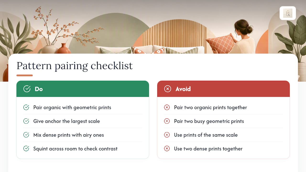
Pattern types pair best when they contrast in shape, not just color. An organic print, think florals, botanicals, or watercolor washes, tends to sit well next to a geometric print like stripes, chevrons, or trellis. Two organic prints together often blur into mush from across the room, and two busy geometrics tend to fight for the same visual space.
Scale matters just as much as shape. Your anchor print should carry the largest scale pattern in the group, while your supporting print drops down to medium or small. That size gap is what keeps both patterns readable instead of visually merging into one busy blur.
Density is the other lever. A pattern with lots of white space breathes differently than one that’s packed edge to edge, and mixing a dense print with an airy one usually reads better than pairing two dense prints.
Pro Tip: Squint at your finished arrangement from across the room. If you can still make out distinct shapes in each pillow, your scale contrast is working. If everything blurs into a single mass of color, swap one pillow for a different scale.
Why Solids and Texture Matter More Than a Third Pattern
A solid or heavily textured pillow isn’t a filler piece. It’s what lets your eye rest between two patterns instead of processing three competing prints at once. In a mostly neutral palette, texture can even stand in for a missing pattern, since a nubby knit or a nap of velvet carries its own visual interest without adding another motif to track.
Good texture options include:
- Linen, for a relaxed, lived-in look that works year-round.
- Velvet, for weight and warmth in fall and winter arrangements.
- Chunky knit, for casual texture that pairs well with lighter linens.
- Embroidery, for subtle pattern without loud color.
- Leather or faux leather accents, for a grounding contrast in modern rooms.
Place your solid or textured pillow between your two prints, not off to one side. That positioning is what actually breaks up busy patterns instead of letting them sit next to each other unchecked.
What Sizes and Arrangements Actually Look Polished?
Sizing turns a good pattern mix into a finished vignette. The standard back pillows for a sofa run 22 to 24 inches square, front pillows drop to about 20 inches, and lumbar pillows typically measure 12 by 20 or 14 by 24 inches. Those proportions exist because they scale naturally to most sofa depths and cushion heights, based on common sizing guidance from professional stylists.
Here’s how to put it together:
- Choose an insert about 2 inches larger than your pillow cover in every dimension. A 20 inch cover gets a 22-inch insert. This is what creates the plump, unfussy fill designers use.
- For a standard sofa, arrange two large back squares, two smaller front squares, and one lumbar pillow in the center. That’s the 2-2-1 rule, and it’s the most forgiving layout for beginners.
- For an armchair, one lumbar pillow alone often reads cleaner than a full set.
- For a bed, layer euro shams behind standard pillows, then add a lumbar or accent pillow in front for depth.
- Spread your accent color across at least two pillows instead of concentrating it in one spot, so the eye travels evenly across the arrangement instead of snagging on a single corner.
What Are Some Ready-to-Copy Pillow Pattern Combinations?
You don’t need to design a palette from nothing. Borrow one of these combinations and adjust the colors to your room.
- Tonal blend: Three patterns in the same color family but different scales, like a large floral, a small check, and a solid in matching cream. Works on neutral sofas that need warmth without contrast.
- Bold black and white: A large graphic print, a fine stripe, and a solid black lumbar. Reads modern on almost any sofa color.
- Botanical mix: A large-scale leaf print, a narrow stripe, and a chunky knit solid. A dependable combo for rooms with a lot of green or natural light.
- Global or ethnic mix: A block print, a small ikat, and a solid in one shared accent color. A shared color or technique is what keeps visually different patterns from feeling random together.
- Rug-remnant pairing: Pillows made from leftover rug fabric paired with a solid velvet. Reusing a technique or material you already own instantly ties the pillows to the room.
- Seasonal swap: Keep your solid and one print as year-round anchors, then rotate the third pillow between a lighter pattern in summer and a heavier texture in winter.
Tonal and botanical combos suit neutral sofas best. Bold contrast and global mixes hold up better on colored sofas or patterned rugs, where you already have visual noise to match.
Author Tips and Noble Abode Guidance
Stephane’s rule of thumb: buy your anchor print first, then shop textures second. A durable weave like cotton twill or a performance velvet holds up to daily use better than delicate silks, and Noble Abode’s pillow cover guidance covers care basics for common fabrics.
Pick one statement piece from a curated collection, then fill in with affordable solids. Before ordering, measure your sofa’s cushion depth and confirm your insert is roughly 2 inches larger than the cover for the fullest look.
What I’ve Learned From Watching Pillow Arrangements Fail (and Work)
Most bad pillow arrangements aren’t missing good pillows. They’re missing an editor. People buy pattern after pattern because each one looks great alone in a store, then wonder why the sofa looks chaotic once they’re all together. The fix isn’t more shopping. It’s removing one pillow and asking whether the remaining group still tells a single color story.
Noble Abode built its decorative pillow collection around that same instinct: fewer, better pieces in materials that last, chosen to anchor a room rather than clutter it.
— Stephane
Start With One Statement Pillow From Noble Abode
This kind of editing starts with one curated statement piece and builds outward, following the anchor-first approach the Rule of Three depends on.

The Light Luxury Retro Style Pillow for Sofa & Bedside works well as your anchor print, since its scale and finish are strong enough to set the palette for the rest of the arrangement. Pair it with the YCOLL Dark Grey Pillow Covers as your textured, supporting piece. The velvet stripe adds density without competing for attention, and the 26x26 size gives you a back-pillow anchor point on a standard sofa. If you’re building a full vignette rather than shopping pillow by pillow, the Retro Luxury Sofa Bed with Pillows gives you a backdrop where the pattern mix is already worked out.
For insert sizing, follow the same 2 inch rule covered above: order your insert slightly larger than the cover for a plump, unfussy fill. Browse the full Luxury Decor collection to see how these pieces work alongside vases, lighting, and other statement items for a room that reads as finished, not accumulated.
Sources
- How to Mix Pillow Patterns Without It Looking Accidental — Kevin Francis Design
- How to Mix and Match Throw Pillows — Studio McGee
- 20 New And Fresh Affordable Pillow Combos (+ Our 5 No-Fail Combo Rules) — Emily Henderson
- Mix Pillow Patterns Like a Pro: 17 Foolproof Themes — Houzz
FAQ
Can You Mix Pillow Patterns?
Yes. The most reliable method caps the mix at two to three patterns using an anchor print, a supporting print, and a solid or texture, which keeps the combination from looking accidental.
What Is the 2-2-1 Rule for Pillows?
The 2-2-1 rule arranges two large back pillows, two smaller front pillows, and one lumbar pillow in the center of a standard sofa, creating a layered but balanced look.
What Are the Pillow Trends for 2026?
Tonal color blending, botanical prints paired with texture, and mixed-material combinations like knit alongside velvet remain the most consistent approaches designers return to, layered with rotating seasonal accent colors.
How Do You Mix and Match Pillows?
Choose an anchor print first, add a supporting print in a different scale that shares a color with the anchor, then finish with a solid or textured piece to give the eye somewhere to rest.
Can I Buy a Ready-Made Pillow Pattern Combination?
Some curated pillow selections pair statement anchor pieces with textured supporting pillows, allowing you to start from a combination that’s already been color matched instead of building one from scratch.